
Introduction:
Salesforce CRM (Customer Relationship Management) is a powerful platform designed to help organizations manage and streamline their customer interactions, sales processes, and overall business operations. It provides a centralized hub for collecting, organizing, and analyzing customer data, enabling companies to enhance customer relationships, improve sales efficiency, and make data-driven decisions.
Significance of Dashboards:
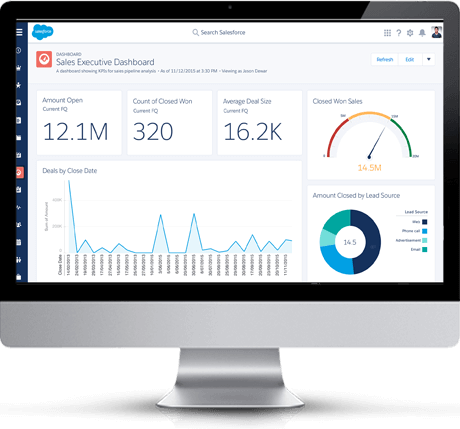
In the realm of Salesforce CRM, dashboards play a crucial role in providing a visual representation of key performance indicators (KPIs) and important data metrics. A dashboard is essentially a customizable interface that allows users to consolidate and visualize data in a way that is easy to understand and interpret. Dashboards serve as a valuable tool for decision-makers, as they offer a real-time snapshot of the organization’s performance and facilitate informed decision-making.
Role of Dashboards in Visualizing and Analyzing Data:
- Data Visualization:
Dashboards in Salesforce CRM enable users to create visually appealing charts, graphs, and tables that represent complex data sets. This visual representation makes it easier for users to grasp trends, patterns, and insights, as compared to analyzing raw data. Whether it’s sales performance, customer satisfaction, or other business metrics, dashboards help transform data into a format that is easily digestible.
- Real-Time Monitoring:
Dashboards provide real-time updates on critical metrics, allowing users to monitor the current status of various aspects of their business. This real-time visibility is essential for making quick and informed decisions, especially in dynamic and fast-paced business environments.
- Customization for Specific Roles:
Salesforce CRM allows users to customize dashboards based on specific roles within the organization. Sales teams might focus on opportunities and revenue, while customer support teams may prioritize cases and customer satisfaction metrics. This role-specific customization ensures that each user gets the most relevant information for their responsibilities.
- Drill-Down Capabilities:
Dashboards often offer drill-down capabilities, allowing users to explore deeper layers of data for a more detailed analysis. This feature is particularly useful when identifying the root causes of issues or investigating specific trends.
- Accessibility and Collaboration:
Dashboards are accessible from anywhere with an internet connection, enabling remote teams and executives to stay connected and informed. Additionally, they facilitate collaboration by providing a centralized platform where teams can share insights and collaborate on strategies based on the visualized data.
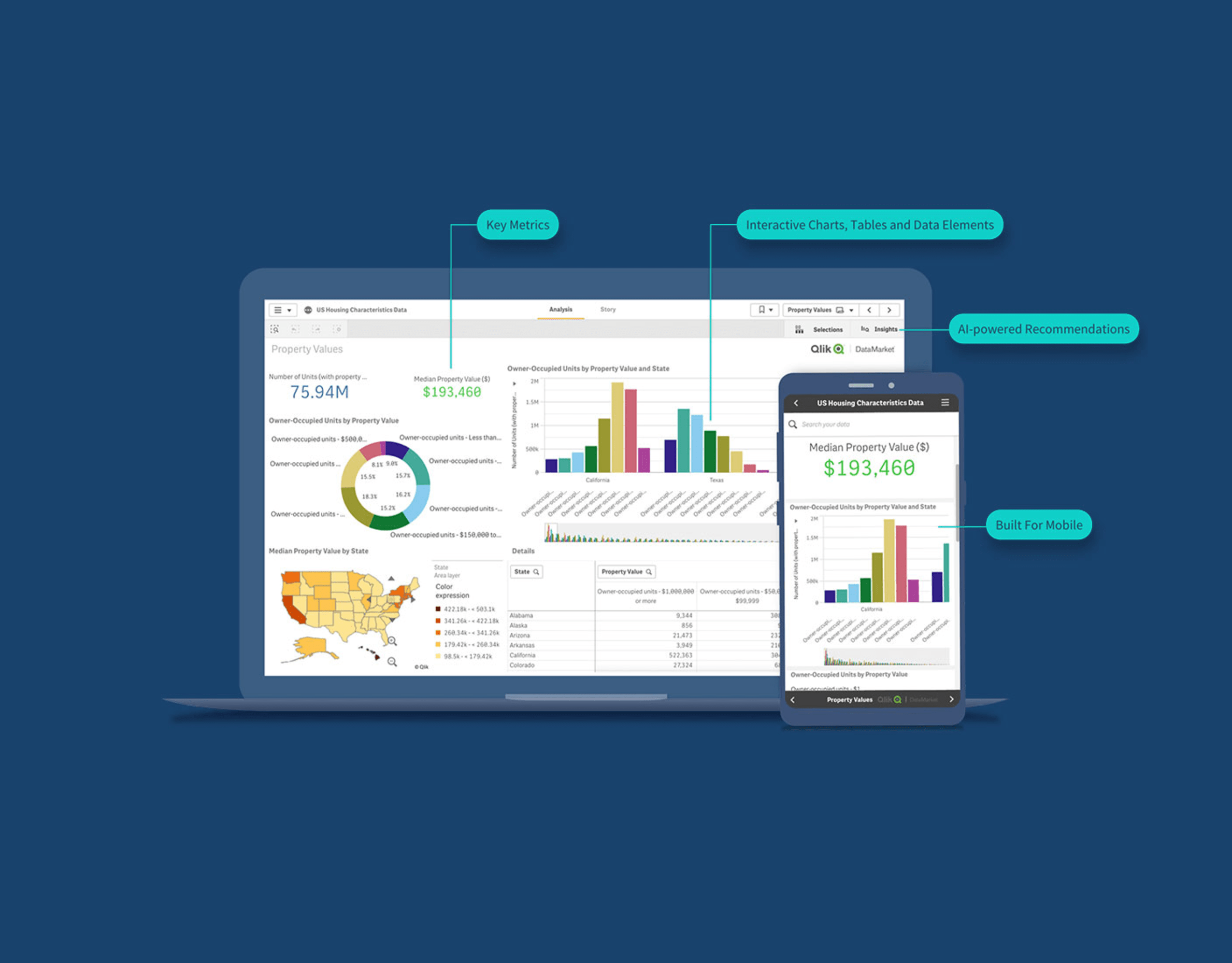
Understanding Salesforce Dashboards
Overview of Salesforce Dashboards:
Purpose: Salesforce dashboards serve as dynamic, interactive, and customizable interfaces that display key metrics and data from your Salesforce records. They are designed to give users a comprehensive view of their data, helping them track performance, identify trends, and make data-driven decisions.
Different Types of Dashboards:
Home Page Dashboards: These dashboards can be set as the default landing page for users when they log in to Salesforce. Home page dashboards provide a quick snapshot of important metrics and KPIs relevant to a user’s role or responsibilities.
Report Dashboards: These dashboards are built on top of existing Salesforce reports. You can add multiple report charts to a dashboard, allowing users to view and analyze data from different reports in a consolidated view.
Analytic Dashboards: Analytic dashboards offer more advanced features, enabling users to create complex charts, tables, and other visualizations. They provide a higher level of customization and are suitable for users who require in-depth analytics and insights.
Explanation of Components:
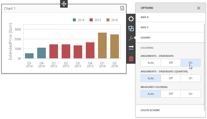
Charts: Charts are graphical representations of your data and are a fundamental component of Salesforce dashboards. Common types of charts include bar charts, pie charts, line charts, and gauge charts. Users can choose the type of chart that best suits their data visualization needs.
Tables: Tables display tabular data in rows and columns. Users can include relevant fields and sort or filter the data to focus on specific information. Tables are useful for displaying detailed records and can be added to dashboards to complement other visual components.
Metrics: Metrics are numerical data points that provide a quick summary of key performance indicators (KPIs). They are often displayed as standalone values or in conjunction with other components on the dashboard. Metrics help users quickly assess the current state of their business processes.
Visualforce Pages: Visualforce is a powerful markup language that allows users to create custom pages within Salesforce. Visualforce pages can be embedded in dashboards to display custom content, interactive elements, or external web content. This feature adds a high level of flexibility to dashboards, enabling users to tailor the interface to their specific needs.
Salesforce dashboards are essential tools for users to gain insights, monitor performance, and make informed decisions. The variety of dashboard types and components cater to different user preferences and analytical requirements, providing a versatile platform for data visualization within the Salesforce ecosystem.
Importance of Customization
Tailoring Dashboards to Specific Business Needs:
Customization allows organizations to design dashboards that align with their unique business requirements and goals. Different departments within a company often have distinct key performance indicators (KPIs) and metrics that are crucial for their success. Customizing dashboards ensures that the relevant information is easily accessible, providing actionable insights specific to each business function.
For example, sales teams might focus on revenue, conversion rates, and lead generation, while marketing teams may prioritize metrics like website traffic, social media engagement, and campaign performance. Customization enables the creation of tailored dashboards that cater to these specific needs, facilitating more informed decision-making.
Enhancing User Experience and Engagement:
Generic, one-size-fits-all dashboards may not effectively engage users or provide a positive experience. Customization allows for a user-centric approach, where individuals can choose the data visualizations, charts, and metrics that are most relevant and meaningful to them.
By enabling users to personalize their dashboards, organizations can enhance user satisfaction and engagement. A more intuitive and personalized interface increases the likelihood that users will interact with the dashboard regularly, leading to a more informed and proactive user base.
Impact on Productivity:
Customized dashboards contribute to increased productivity by presenting information in a format that resonates with users. When employees can quickly access and understand the data most relevant to their responsibilities, they can make faster and more informed decisions.
Additionally, customization minimizes the time spent searching for specific data points or navigating through irrelevant information. This efficiency gain directly translates into improved productivity across the organization.
Data-Driven Decision-Making:
Customized dashboards play a pivotal role in fostering a data-driven culture within an organization. By tailoring the visualizations and reports to align with business objectives, decision-makers can rely on accurate and pertinent information to inform their strategies.
The ability to customize dashboards empowers users to analyze data in ways that are most meaningful to them, facilitating a deeper understanding of trends, patterns, and opportunities. This, in turn, enables more confident and data-driven decision-making processes.
Basic Dashboard Customization
Step-by-step guide to creating a new dashboard:
This involves providing users with a detailed sequence of actions to initiate the creation of a new dashboard. It may include instructions on accessing the dashboard creation interface, specifying parameters such as title and layout, and confirming the creation process.
Adding and arranging components:
Once the dashboard is created, users need to add components such as charts, tables, metrics, or other relevant elements. The guide should outline the process of selecting and inserting these components into the dashboard.
Arranging components refers to the ability to organize and position them within the dashboard for optimal visualization. This could involve dragging and dropping elements, adjusting their sizes, or placing them in specific sections of the dashboard.
Customizing dashboard properties and settings:
Dashboard properties encompass a range of characteristics, including the title, description, color scheme, and any other visual or informational elements that define the dashboard. Users should be able to customize these properties to align with their preferences or corporate branding.
Settings might include options for data refresh intervals, date ranges, and other parameters that affect the behavior and appearance of the dashboard. Customization of these settings allows users to tailor the dashboard to their specific needs.
Introduction to standard components: Charts, Tables, Metrics:
Providing an overview of standard components helps users understand the types of elements they can incorporate into their dashboards.
Charts: Graphical representations of data, such as bar charts, line graphs, pie charts, etc., to visually convey trends or comparisons.
Tables: Structured displays of data in rows and columns, suitable for presenting detailed information.
Metrics: Key performance indicators (KPIs) or other numerical values that offer quick insights into the health or status of a system, process, or project.
Utilizing Report Data in Dashboards
Linking Reports to Dashboards:
Dashboards often aggregate data from various sources, including reports. Linking reports to dashboards means establishing a connection between the detailed information in reports and the summarized or visual representations in dashboards.
This linkage allows users to seamlessly navigate between the high-level insights presented on the dashboard and the detailed data available in associated reports.
Incorporating Report Data into Dashboard Components:
Dashboards typically consist of various components like charts, graphs, tables, and other visual elements. Incorporating report data into these components means populating them with the relevant information from reports.
For example, a bar chart in a dashboard might display summarized sales data from a report, allowing users to quickly grasp trends and patterns without delving into the detailed report itself.
Benefits of Using Dynamic Report Filters:
Dynamic report filters enhance the interactivity of dashboards by allowing users to manipulate and filter data in real time. This means that users can customize the information displayed on the dashboard based on their specific criteria or preferences.
For instance, dynamic filters might enable users to adjust the date range, select specific categories, or filter by other parameters relevant to the data. This flexibility enhances the usability of dashboards and provides a more tailored and actionable user experience.
Dynamic report filters also save time, as users can quickly explore different facets of the data without the need to generate new reports or modify existing ones.
Enhanced Decision-Making:
The integration of report data into dashboards contributes to more informed decision-making. Users can quickly identify trends, anomalies, and key performance indicators without having to sift through extensive reports.
By presenting data in a visually appealing and easily digestible format, dashboards facilitate quicker decision-making processes, enabling organizations to respond promptly to changes or opportunities.
Improved User Experience:
Dashboards offer a user-friendly interface for accessing and interacting with data. By linking reports to dashboards and incorporating dynamic filters, the user experience is further enhanced.
Users can seamlessly transition from an overview provided by the dashboard to detailed insights available in associated reports, creating a cohesive and intuitive experience.
In summary, the integration of report data into dashboards, coupled with dynamic filters, enhances the accessibility, interactivity, and effectiveness of data-driven decision-making processes. This approach not only streamlines the presentation of information but also contributes to a more user-friendly and efficient analytical experience.
Advanced Dashboard Components:
This likely refers to enhancing the visual representation of data on Salesforce dashboards. Advanced components could include more sophisticated charts, graphs, and data visualizations to provide users with a comprehensive and insightful view of their data.
It may involve configuring and customizing Salesforce dashboards to display key performance indicators (KPIs) or other metrics in a more visually appealing and informative manner.
Exploring Advanced Chart Options:
This involves delving into the various charting options available in Salesforce. This could include bar charts, pie charts, line charts, scatter plots, and other visualization tools that help users analyze and interpret their data effectively.
Advanced chart options might involve configuring dynamic charts, setting up drill-down capabilities, or incorporating real-time data updates for a more interactive user experience.
Incorporating Visualforce Pages and Web Links:
Visualforce is a framework that allows developers to build custom user interfaces for Salesforce applications. Incorporating Visualforce pages means creating custom pages with a high degree of flexibility and control over the user interface.
Including web links suggests integrating external content or linking to external websites directly from within the Salesforce environment. This can enhance the user experience by providing seamless access to relevant information.
Introduction to Custom Components and Lightning Components:
Custom components are likely referring to the creation of bespoke elements tailored to specific needs. This might involve building custom fields, objects, or other components to address unique business requirements.
Lightning components are a specific type of custom component in the Salesforce Lightning framework. They are reusable building blocks that can be assembled to create modern and responsive user interfaces. This could involve developing Lightning components to enhance the functionality and appearance of Salesforce applications.
Security and Sharing Settings
Security Settings:
Access Control: This involves controlling who can access the dashboards. Security settings may include user authentication, authorization, and role-based access control (RBAC). User roles define the level of access and permissions each user has within the dashboard system.
Encryption: Ensuring that the data transmitted between users and the dashboard, as well as the data stored, is encrypted to prevent unauthorized access or interception.
Folder Permissions:
Organizational Structure: Dashboards are often organized into folders for better management. Folder permissions allow administrators to control which users or groups have access to specific folders.
Read/Write Permissions: Administrators can set different permission levels for users within folders, such as read-only or read-write access. This ensures that only authorized individuals can make changes to certain dashboards or data.
Sharing Dashboards:
User Groups: Dashboards can be shared selectively with specific user groups. This is useful for targeting specific teams or departments within an organization. User groups can be predefined or customized based on organizational structure.
Link Sharing: Some systems allow for the generation of shareable links to dashboards. These links can have different access levels, such as view-only or edit access, and may or may not require authentication.
Collaborative Features: Enabling features like real-time collaboration allows multiple users to work on and interact with the same dashboard simultaneously.
Audit Trails:
Tracking Changes: Security settings often include the ability to track and log changes made to dashboards. This audit trail helps administrators monitor user activities, ensuring accountability and providing a record of who accessed or modified the dashboards.
Alerts and Notifications: Setting up alerts or notifications for specific events, such as unauthorized access attempts or significant changes to dashboards, enhances security measures.
Integration with Identity Providers:
Single Sign-On (SSO): Integration with identity providers allows users to log in using their existing credentials, streamlining the authentication process and maintaining consistency with the organization’s security policies.
Real-time Data and Streaming:
Data Processing in Real Time: Traditional data processing involves collecting and storing data for later analysis. In contrast, real-time data processing involves analyzing and acting on data as it’s generated, providing near-instantaneous results.
Streaming Technology: Streaming technology enables the continuous flow of data, allowing for real-time processing. This is especially useful in scenarios where data is generated rapidly, such as social media updates, sensor readings, financial transactions, or IoT devices.
Leveraging Streaming Datasets for Real-time Updates:
Continuous Flow of Data: Streaming datasets provide a continuous flow of information, ensuring that insights are based on the most recent and relevant data.
Immediate Responses: By leveraging streaming datasets, organizations can respond swiftly to changes, emerging trends, or critical events, enhancing their agility and decision-making capabilities.
Integrating External Data Sources for Dynamic Dashboards:
Diverse Data Sources: Dynamic dashboards are interactive and can incorporate data from various sources. Integrating external data sources, such as social media feeds, market updates, or weather data, enhances the richness and context of the information presented.
Real-time Visualization: Dynamic dashboards update in real-time, providing stakeholders with up-to-the-minute insights, and fostering more informed decision-making.
Use Cases for Real-time Data in Decision-making:
Financial Trading: In financial markets, real-time data is crucial for making split-second decisions. Traders rely on up-to-the-minute market data to execute trades and manage risks.
Healthcare Monitoring: Real-time data from patient monitoring devices and electronic health records enable healthcare professionals to respond promptly to changes in a patient’s condition.
Supply Chain Optimization: Real-time tracking of inventory, shipments, and demand allows organizations to optimize their supply chains, minimize disruptions, and respond swiftly to changes in demand.
Customer Engagement: Businesses can use real-time data to personalize customer experiences, offer targeted promotions, and address customer issues promptly.
Monitoring and Analyzing Dashboard Performance:
Monitoring: This involves keeping a close eye on the various aspects of dashboard performance, such as load times, user interactions, and data retrieval. Monitoring helps identify potential issues and ensures that the dashboard is functioning as intended.
Analyzing: Involves a deeper examination of the collected data. This analysis could include identifying trends, pinpointing bottlenecks, and understanding user behavior to make informed decisions about potential optimizations.
Utilizing the Salesforce Optimizer:
Salesforce Optimizer: This is a tool provided by Salesforce to help organizations assess and improve their Salesforce implementations. It provides insights into the configuration, usage, and performance of various Salesforce features, including dashboards. By using the optimizer, organizations can identify areas for improvement and enhance the overall efficiency of their Salesforce instance.
Analyzing Dashboard Load Times and Data Source Performance:
Dashboard Load Times: Refers to the time it takes for a dashboard to load and become accessible to users. Analyzing load times helps in identifying any delays or inefficiencies in the rendering of the dashboard components.
Data Source Performance: Examining the performance of data sources is crucial. This involves assessing the speed at which data is retrieved from underlying databases or external systems. Optimizing data source queries and connections can significantly enhance the overall dashboard performance.
Tips for Optimizing Dashboards for Better Performance:
Data Query Optimization: Refining the queries used to fetch data for the dashboard can improve load times. This may involve optimizing filters, reducing unnecessary data fetching, and ensuring that queries are efficiently structured.
Widget and Component Optimization: Evaluating the efficiency of individual components within the dashboard. This includes minimizing the use of complex visualizations that may slow down rendering and optimizing the layout for better user experience.
Caching Strategies: Implementing caching mechanisms can reduce the need to fetch the same data repeatedly, especially for static or less frequently changing data.
Regular Maintenance: Dashboards may need periodic reviews and adjustments as data volumes and user requirements evolve. Regular maintenance ensures that the dashboard continues to perform optimally over time.
Conclusion
Salesforce CRM dashboard customization is a powerful tool that empowers organizations to harness the full potential of their data. By creating personalized, visually appealing dashboards, businesses can streamline decision-making processes and gain a competitive edge. This comprehensive guide has covered the fundamental concepts, customization options, and best practices to help users master the art of Salesforce CRM dashboard customization.


