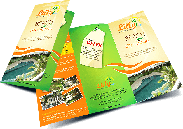
A brochure is an informative paper used for advertising that is folded into small templates or pamphlets. Brochures are documents that is primarily used to introduce company’s organization, products, services or information to the customers or the public. Brochures will be distributed in many ways such as newspapers, mail or magazines. They may be considered as the grey literature which is before and after the publish and ideas. A brochure is usually folded and include information that gives publicity on a particular topic.
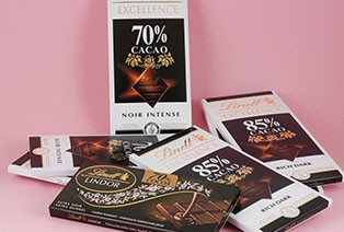
WHY BROUCHER
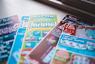
• A designed brochure serves as an introduction to the business.
• Distributing of brochures can expand company’s visibility.
• It is a great marketing tool to reach new customers.
• Provide positive reports about a company.
• Used for trading and networking opportunities.
TYPES OF BROUCHERS
GATE-FOLD
This type of brochures are used quite rare because they are a little expensive than the traditional graphic brochure designs. They are printed only for high end marketing. The inward fold of this brochure makes it small and easy to carry. The brochure’s eight-panel structure provides more space for graphic designs to illustrate the information and images of the product or service of the brand in detail.
BI-FOLD
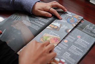
This type of brochure is commonly used among the companies. The bi-folded brochure is created by folding the brochure into two equal halves. By this fold, the brochure gets four panels of displaying information, the front cover, back cover and two internal panels. This brochure is easy to hold and go through the information. A multiple pages of this Boucher makes a magazine. This kind of brochure is good for companies to advertise multiple products such as restaurant menus.
TRI-FOLD
This brochure is exactly same as the bi fold Boucher. This consists of three folded panels that provide enough space to display information. It can be folded in any ways to optimize its function. Horizontal folds for wider but shorter panels. Vertical folds for narrower but taller panels. Such folds make the six paneled brochure a small and compressed one, making it easier to read it and carry.
Z-FOLD
This brochure is folded into a zigzag shape form. This Z fold of the brochure is commonly used when the information is having images. The brochure has six panels in total giving plenty of space to display the graphic design images that can spread over from one panel to the other. This brochure is good to be used for large graphs, maps, food menus, product details or heavy image designs.
USES OF BROUCHERS
• Company Brochures
• Product sales Brochures
• Spec Sheets
• Event Brochures
• Menus Brochures
• Mailer Brochures
BROUCHER DESIGNING STEPS
BEFORE YOU START DESIGNING YOUR BROCHURE
KNOW YOUR BRAND PERSONALITY
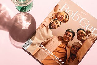
• Brand’s identity
• Personal branding
• Developing entrepreneur branding
DEVELOP YOUR MESSAGE
• You need to know what you’re going to say in your brochure and how you’re going to say it before you think about getting a design in place.
• Message is the most important thing. If we don’t have a strong, clear message in proper language and images they is related to the product the brochure will be simple and flat.
• When we enter the email we get free brochure ebook, along with creative tips, trends and resources on that occasion.
• On completing the form, you agree to our Terms of Service and Privacy Policy and the site is protected by CAPTCHA.
DETERMINE YOUR METRICS FOR SUCCESS
· On looking to drive people to the retail location we can include a coupon or a voucher to measure how many of them are accepted with your store.
· On trying to drive people to the website we can Include a custom url on the pamphlet and track the number of visitors on our website.
· On trying to create good sales on any new product launched we can include a CTA to sign up on our email list to get updates and see how large the lists grows on the sales.
SET YOUR BUDGET
• The budget is more than just knowing how many brochures we can print. It depends on everything from the type of paper printing techniques used to built up sales using the brochures.
• Come up with the budget per print and make decision based on what is more important. Have cool ideas to illustrate the points.
• Knowing how much cash you have to invest for the design and printing process which will help to bring out the best out of every money we spend.
DEFINE YOUR IDEAL CUSTOMER
• Who is my ideal customer
• What kinds of information they look for
• Are they likely to respond to more images or text
• What kind of copy do they expect whether Corporate or conversational, Humorous or serious.
• What can I do to grab their best attention
DESIGNING YOUR BROCHURE
REMEMBER YOUR BRAND IDENTITY
• While starting the designing process keep the brand identity in mind. These elements describe the visual look and feel of the brand and no matter what kind of brochure you’re designing, it needs to be consistent with the branding overall.
• Choose design elements like colors, fonts, and images that match the brand products and the tone and content of your brochure.
DESIGN WITH THE READER IN MIND
• As a designer it is easy to get caught up with what you want the customer wants that counts.
• keep your reader in mind how the customer want to receive information where the things need to be made up with images or specific colors or fonts that would be particularly appealing.
• When you are designing make sure to lay things out in a way that appeals to the customer.
GATHER YOUR COPY AND IMAGES
• Have the copy and images ready before starting to creating the design, it will help to take decisions on the Boucher layout.
• More of designs must be restricted which will affect the amount of text and images which is include.
• Including a lot of copy in your design can deliver a lot of information for your readers. But the huge text blocks can feel distracting so keep the copy anywhere in the middle.
• The readers who don’t have patience to read. Gather all the images in front that helps to figure out to tell the story and where they should be placed.
• use creative elements to tell the story your audience needs to hear.
FIND YOUR STYLE
• The stylistic elements are really going to make the brochure shine.
• Do not overcrowd the brochure design with too much of texts, graphics, or different design elements which will distract reader’s attention. Keep your design clean, simple, and easy for the reader to get best outcomes.
• Consumers these days have more expectations. They don’t want the same bunch of old designs. To make the brochure make an impact on the audience.
• We have to create something unique everytime. The more new style we include on the brochure, the more it bounds to grab people’s attention.
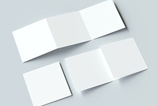
CHOOSE YOUR BROCHURE TYPE
• Single gate fold
• Tri-fold
• Z-fold
• Parallel fold
• Roll fold
• Accordion fold
• Double gate fold
• Half + half fold
• Half + tri-fold
• Half-fold
• Half-fold (letter)
EVALUATING AND PRINTING YOUR BROCHURE
CHOOSE YOUR PRINTER
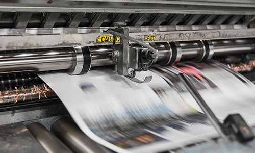
• Your options on the ink.
• Best printing option for time and cost
• Choose matching and contracting colors
• Choose offered prints or digital proofs
• Have experience in brochure printing and designing.
• Provide a reference for other brochure clients.
CHOOSE YOUR PRINT MATERIALS
PAPER WEIGHT
The higher the paper weight is the thicker is the sheet. There are a ways to measure the paper weight on the basis weight mils. The common way to measure is the metric weight also known as GSM. The GSM is the weight of one sheet of paper cut into a 1×1 meter square.
FINISH
• Matte: A completely flat finish without any shine
• Semi-Gloss: A somewhat shiny finish that falls between matte and glossy
• Glossy: A shiny, reflective finish
INK AND SPECIALITY PROCESSES
• Foil: A shiny, metallic ink or stamp that reflects light
• Embossing: The process of pressing a shape or image into paper to create a raised effect
• UV spot: A shiny coating applied only to certain spots of paper typically the logo, headline or the accents.
FOLDING THINGS UP
Now everything you need to get out there and design is an incredible brochure that will delivers the brand’s message to the consumer and inspire to take action and bring them closer to the goals.
FAQS
It is the folded sheets that includes the textual and visual information used for the purpose of promotion and marketing. Its purpose is to spread information and motivate the audience. The purpose of the brochure is that determines whether it should be more of texts or images. It depends on the different brands for example in case of tourism images play an important role and in medical brochure focuses more on texts.
Yes, This is the reason the business organizations use it which helps them to attain their promotional goals in an effective way. It is designed and presented in a way that makes the reader to immediately get hooked onto it. The given out information has to be correct otherwise it will not create the desired impact. The marketers are responsible to choose the proper design for the brochure that perfectly suites the purpose.
• Logo
• Color scheme
• Photographs
• Discretion
bi-fold, tri-fold, gate-fold and Z-fold.
